Correlation value and method gets placed in plot caption / bottom-right.
Usage
plot_scatter(
  df = NULL,
  xval,
  yval,
  label = NULL,
  group = NULL,
  colors = NULL,
  rank = FALSE,
  xlabel = ifelse(methods::is(xval, "character"), xval, "X"),
  ylabel = ifelse(methods::is(yval, "character"), yval, "Y"),
  cormethod = c("pearson", "spearman", "none"),
  guides = TRUE,
  pt_size = 2,
  pt_alpha = 1,
  lbl_size = 3,
  density = FALSE,
  reverse = FALSE,
  title = NULL,
  subtitle = NULL,
  savename = NULL,
  width = 8,
  height = 8
)
Arguments
- df
dataframe; includes both signatures
- xval
string/numeric vector; colname for x axis
- yval
string/numeric vector; colname for y axis
- label
string; colname for point labels
- group
string; colname for group color
- colors
char vector; list of colors, where length = # unique groups
- rank
logical; change metric to rank
- xlabel
string; xval description
- ylabel
string; yval description
- cormethod
string; correlation method for stats::cor() or "none"
- guides
logical; T to include fitted linear model line
- pt_size
numeric; point size
- pt_alpha
numeric; point alpha value
- lbl_size
numeric; label text size
- density
logical; show density plot along both axes
- reverse
logical; T to reverse both axes
- title
string; plot title
- subtitle
string; plot subtitle
- savename
string; filepath to save figure under
- width
numeric; plot width
- height
numeric; plot height
Examples
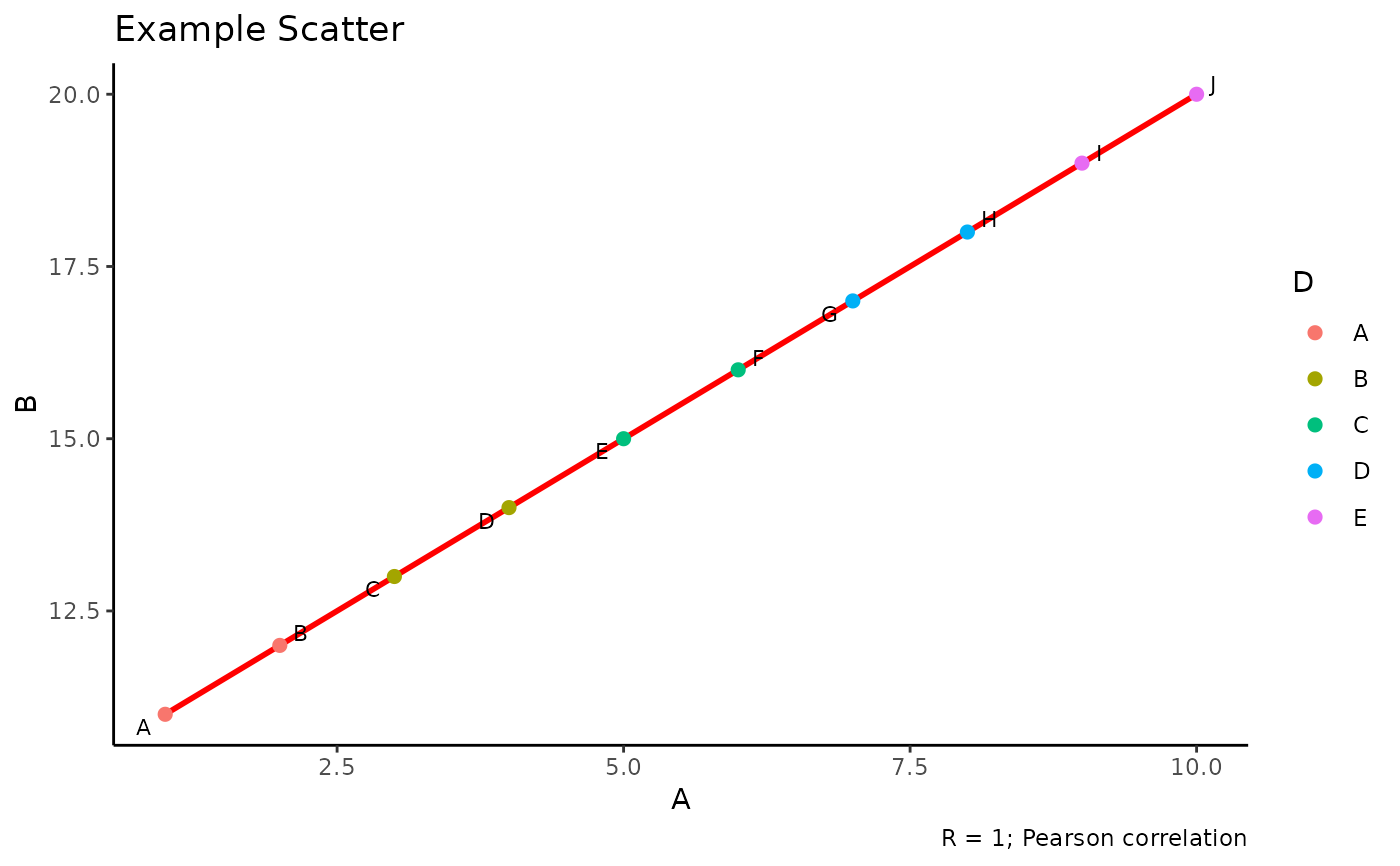
df <- data.frame(A = 1:10, B = 11:20, C = LETTERS[1:10], D = rep(LETTERS[1:5], each = 2))
plot_scatter(df, xval = "A", yval = "B", label = "C", group = "D", title = "Example Scatter")